

Five Logo Variations Every Brand Should Have
Why Logo Variations Matter
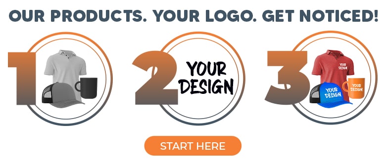
A logo is the foundation of a brand's identity. It's ubiquitous: on a website, business cards, social media, packaging, and promotional products. But one logo isn't enough to cover every scenario! That's why strong brands build a logo system, with variations designed for different uses.
Between full layouts with icons and taglines to stripped-down logos sized for a browser tab, each version has a role to play. The right variations make a logo adaptable, consistent, and recognizable no matter where it appears.
The Five Logo Variations Your Brand Needs:
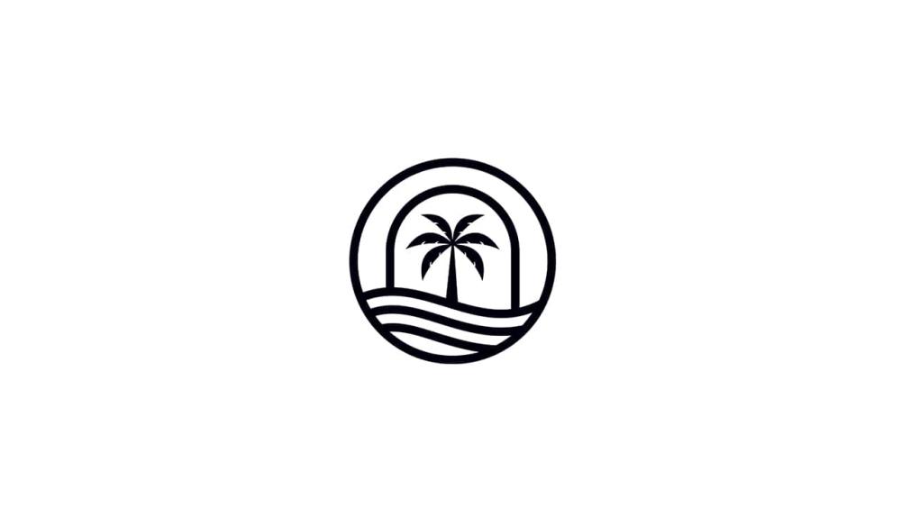
1. Primary Logo
![]()
Your primary logo is the full expression of your brand identity. It's usually the most detailed and complete version of the logo—a combination of the logotype (the stylized name, which we'll discuss later) and an accompanying logomark or tagline, arranged in a lockup (set layout of these elements).
This is the version you'll see most often: on websites, signage, business cards, and presentations. It has the most information and is designed to carry the full weight of your branding. Since the primary logo design gets used in many places, it's usually made in special file types called vector formats (like AI, EPS, or SVG). These allow the logo to stay clear and sharp, whether printed small on a pen or blown up large on a banner.
2. Alternate Logo
![]()
An alternate or secondary logo is just what it sounds like: another version of your primary design. It may use a stacked arrangement or a horizontal logo instead of a vertical one; it should essentially be the opposite of the primary lockup. The goal is flexibility: the alternate keeps your branding consistent when the main logo doesn't fit neatly in a space.
You'll often see stacked logos on lanyards or small tech accessories with limited space. Horizontal alternates are also common for digital uses like website headers or email signatures, where a full primary lockup might feel too crowded. By creating one or two alternate layouts in advance, your brand avoids awkward resizing or cropping, and your visuals always look intentional.
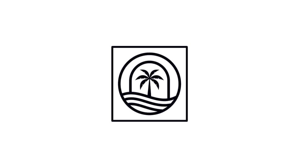
3. Submark
A submark is a distilled version of your logo, usually designed in a circular or square format. Think of it as your logo's stamp — compact, balanced, and versatile. Submarks often feature just an icon, initials, or a stripped-down design that still feels unmistakably tied to the primary logo.
Brands use submarks in places where a full logo won't fit or feels too formal. They're popular for watermarks on photography and small-scale promotional items like pens or charging cables. A strong submark ensures your branding remains consistent and recognizable even in tight spaces!
4. Favicon
A favicon is the tiny version of your logo that appears in a browser tab, app icon, or bookmark list. It's the smallest expression of your brand identity (usually 16x16 or 32x32 pixels), so it must be simple and clear at a glance. Unlike a submark, which has broader applications across digital and print, a favicon is strictly a digital icon logo.
Favicons typically use just one element of the primary logo, like a single letter or symbol. While small, they carry a lot of weight in digital branding. When done well, they tie your brand together across platforms, from a desktop browser to a smartphone home screen.
5. Logotype
A logotype, sometimes called a wordmark logo, is built entirely from stylized text. Sometimes, logotypes are strong enough to work as a primary logo! Instead of pairing an icon with lettering, the name is the design. Famous examples include Google and Coca-Cola, where the name and font carry the identity.
Logotypes work best when a brand name is short, distinctive, and easy to read at any size. They translate smoothly across platforms and print methods, making them reliable for everything from digital ads to branded apparel.
What Makes a Good Logo?
A strong logo is clear, consistent, and instantly recognizable. The best designs are identifiable at a glance, yet distinctive enough to stand out in a crowded space. That balance makes a logo memorable and worth using.
Adaptability is just as important. A logo should keep its impact across every format, whether scaled down on a favicon or displayed across a trade show booth. A flexible design ensures your brand looks sharp on business cards, signage, apparel, and anywhere else it appears.
Typography and color choices also matter. They should be consistent with your brand identity so every variation feels connected to the same look and voice. Strong logos are built on elements that last, giving your audience a steady point of recognition year after year.
Make the Most of Your Branding!
Logos are most effective when they work in more than one format. A primary mark, alternates, a favicon, submarks, and a logotype give your brand the flexibility to show up consistently in every setting. Each version has its place, from a large storefront sign to the corner of a web browser tab, and together they create an identity that people can recognize at a glance.
At Logotech, we help brands bring those identities to life. If you need support creating a logo or developing alternate logo styles, our in-house art team is here to guide you. Once your artwork is ready, we produce custom-branded products that make your logo part of everyday life: drinkware, tech gear, apparel, and more. Create an account or reach out to your Logotech account manager to get started!
Frequently Asked Questions
Q: Can the same logo design be used for print and digital?
A: Yes, but it usually requires adjustments. Print versions may need higher resolution or CMYK color, while digital versions use RGB color and may be optimized for small screens.
Q: Are primary and secondary logos necessary?
A: They're not mandatory, but they're practical. A secondary logo will help your brand adapt in spaces where the primary logo doesn't fit or make sense.
Q: What is the difference between a submark and a favicon?
A: A submark is a simplified version of your logo, often used on packaging and apparel. A favicon is the tiny icon at the top of a browser window, specifically designed for digital use at very small sizes. Every favicon could be considered a submark, but not every submark works as a favicon.
Q: What is a vector logo, and why is it important?
A: A vector logo is made with scalable shapes instead of pixels, so it stays sharp at any size. This is essential for creating multiple logo variations without losing quality.
Q: How many logos should a brand have?
A: There's no right or wrong answer, but we recommend at least four logo variations.
Q: Should every logo variation look the same?
A: They should all feel the same, but not identical. The goal is maintaining colors, typefaces, and icons while adjusting the design.