


Custom Calendar Design Tips: How to Design a Calendar Your Audience Will Actually Use
A calendar is one of the only promotional products that earns a spot on someone’s wall or desk for twelve straight months. That’s the whole appeal, and it’s also the challenge. Before you open a template or pick a photo, you need to know what the calendar is actually for and who’s going to be looking at it every day. A calendar designed for a corporate client list needs a different approach than one designed as a personalized gift for family and friends. Get that part right first, and every design decision that follows gets easier.
Why Calendar Design Matters for Brand Visibility
Most promotional products get a few days of attention before they end up in a drawer. A well-designed calendar doesn’t work that way. It hangs on a wall or sits on a desk, and every time someone checks a date, they see your branding along with it. That’s daily, repeated exposure that few other products can match.
The design is what determines whether that exposure works in your favor. A cluttered layout or a hard-to-read grid gets replaced by something more useful the first chance someone gets. A clean, well-organized calendar earns a permanent spot and keeps your logo in front of the same audience day after day. Good calendar design isn’t just about looking polished. It’s what keeps the product in use long enough to deliver on its purpose.
Choosing the Right Calendar Format
Before you touch layout or color, decide on the format. The right calendar format depends on where it’s going to live and how the person receiving it actually works and lives.
Desk Calendars
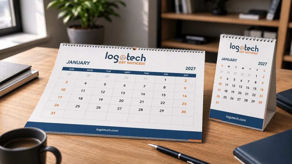
Desk calendars sit right in front of someone at their workspace, which makes them one of the most consistent formats for daily visibility. They help keep a schedule organized without taking up much room, and because they’re used at close range, smaller text and finer design details still read clearly. Desk calendars work well for offices, reception areas, or anywhere someone glances at a schedule multiple times a day.
Easel Calendars
Easel calendars are a compact option for desks, side tables, or shelves where a full-size calendar doesn’t fit. The built-in stand means they don’t need a wall or a mount, which makes them flexible for spaces that a bigger format wouldn’t suit. Because the display area is smaller, easel calendars work best with a strong focal image and minimal extra text competing for space.
Wall Calendars
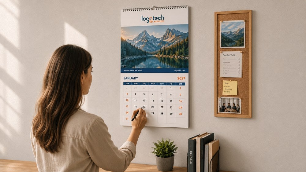
Wall calendars offer the most visibility of the three formats. Many are designed as double page layouts, with a full-page image above the monthly grid, giving the photo room to make an impression before anyone even looks at the dates. Thumb cut wall calendars come in a range of sizes, which makes it easier to match the format to the space it’s going in. For tracking a busy schedule or displaying photos where multiple people will see them throughout the day, wall calendars are usually the strongest choice.
Building the Calendar Layout and Grid
Once you’ve picked a format, the layout is where the calendar either becomes something people rely on or something they eventually take down. The grid needs to prioritize usability over decoration. Leave enough writing space in each date box for someone to actually add an appointment or a reminder. A grid that looks great but leaves no room to write in it stops being useful fast.
Keep month headers, weekday labels, and date numbers in consistent positions from page to page. When someone flips from January to February and the layout has shifted, it slows them down every single time. Starting month matters too. Most calendars run January through December, but a fiscal year or academic year calendar might need a different starting point depending on how it’ll be used.
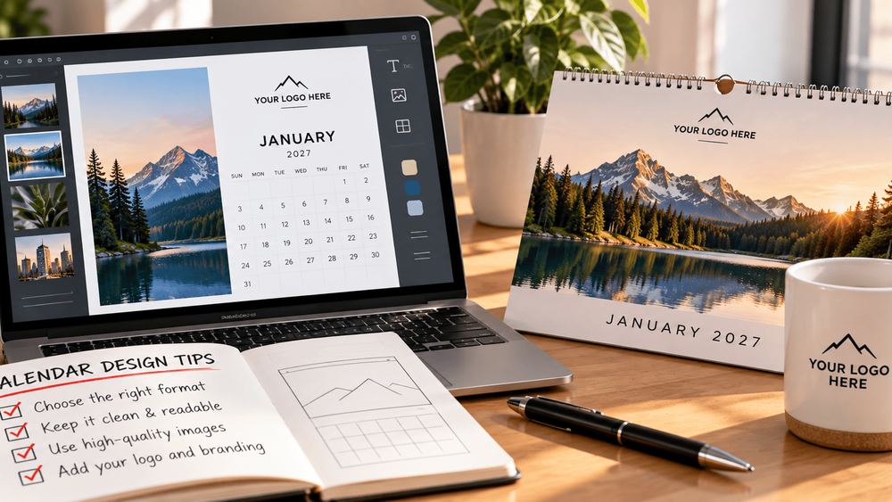
If you’re not designing from scratch, choosing the right template speeds up the whole process. Browse templates that already match your theme and format, filter by layout and orientation, and save the ones that fit so you’re not starting over each time you revise.
Selecting Photos That Print Well
Photos carry a calendar more than any other design element, so this step deserves real time. Curate a photo collection with consistent quality and color tone across all twelve months. A calendar where some months look crisp and others look washed out reads as inconsistent, even if each individual photo is fine on its own.
Use high quality images at 300 DPI or higher. Anything lower prints blurry or pixelated, and low-resolution photos are one of the fastest ways to make an otherwise good design look unprofessional. Discard anything blurry or soft before you commit to a layout, and don’t rely on stretching a small image to fill a bigger frame just because it’s the best shot available.
Organize your photos by month before you start placing them, and think about the order if there’s a story or a seasonal flow to the collection. If the calendar includes personal or team photos, whether that’s employee photos, product shots, or a pet photo calendar for a client gift, own photos tend to perform better than generic stock because they feel specific to the people receiving the calendar. Natural light photography also tends to hold up better in print than images shot under artificial lighting, so when you have a choice between favorite photos from a shoot, lean toward the ones with even, natural light.
Where Your Branding Goes: The Imprint Advantage
This is the part that separates a promotional calendar from a personal one. Your logo, contact information, and website belong on the cover where they’re the first thing anyone sees. From there, look for other places to reinforce the brand without crowding the design: a small logo repeated in a consistent spot each month, a footer strip below the grid, or a QR code linking to a promotion or landing page.
The space below the grid is worth using intentionally. Some clients add a rotating call to action each month, a seasonal promotion, or a short tip relevant to their industry. Others keep it simple with just contact details. Either way, that space is part of the imprint, not an afterthought, and it’s one of the easiest ways to make a calendar work harder for your brand across the full twelve months.
Color, Typography, and Consistency
A calendar with too many colors or fonts starts to feel busy fast, especially across twelve pages. Choose a cohesive color palette and stick with it. Cool blues, warm oranges, or a neutral palette pulled from your brand colors all work, as long as the same tones carry through every month.
Limit yourself to two complementary fonts at most, one for headers and month names and another for dates and any additional text. Maintain consistent margins throughout, and if you want to add decorative elements or illustrations, use them sparingly so they support the design instead of competing with it. Consistency is what makes twelve individual pages feel like one unified calendar instead of twelve unrelated ones, and it’s also what makes the finished product look like something worth the premium paper stock and thicker cover GSM many clients choose for a more durable, higher-quality feel.
Adding Dates That Matter to Your Audience
Standard holidays are a given, but the dates that make a calendar genuinely useful go beyond that. Think about what matters to the specific audience holding it. For a corporate calendar, that might mean industry deadlines, product launch windows, or recurring events built in as editable fields. For a more personal or gifted calendar, that’s where birthdays, anniversaries, and other special dates come in, marked with a small icon so they stand out from the rest of the grid.
Local holidays relevant to the recipient are also worth including if the calendar is going to a specific region or community. The goal is the same either way: give people a reason to look at the calendar beyond just checking the day of the week, whether that’s a professional deadline or a personal milestone they don’t want to miss.
Before You Approve: A Quick Production Checklist
A calendar has twelve pages, which means twelve chances for something small to slip through. Before you send anything to print, double check image resolution on every page, not just the cover. Double check that dates and weekday alignment carry through consistently from January to December. Double check bleed and trim guides are correct so nothing important gets cut off in production. Double check spelling in captions, notes, and any promotional text, since a typo on a page someone looks at every day for a month is hard to miss.
It’s also worth ordering a single printed proof before committing to a full run, especially for a new design or an unfamiliar paper stock. A physical proof shows you exactly how colors, paper, and finishing touches will actually look, which a screen can’t fully replicate. Build in some buffer time for this step. Rushing the final review is how avoidable mistakes end up in a finished product.
Get Custom Calendars with Logotech!
A great calendar design brings a client’s brand, or a family’s best moments, together in a product people genuinely look forward to every year. Whether you’re designing a wall calendar for a shared office space, a desk calendar for individual workstations, or a personalized calendar as a client gift, the right combination of format, imprint placement, and photo quality makes a big difference in how long it stays in use.
At Logotech, we offer a wide range of calendar products and customization options, from templates and paper stock to full imprint placement guidance. Create your own style and order with us, and we’ll help bring your vision to life for the year ahead.
Frequently Asked Questions
Q: How far in advance should I order a custom calendar?
A: Order at least a few weeks before you need it in hand, and earlier if your design needs multiple rounds of proofing or a large print run.
Q: What size works best for desk vs wall calendars?
A: Desk calendars are typically compact for close-range use on a workspace, while wall calendars run larger to stay legible and visible from across a room.
Q: Can I include promotions or QR codes in the design?
A: Yes, many clients add a QR code or a short promotional line below the grid, and it’s an easy way to extend the calendar’s use beyond just tracking dates.
Q: What file format do I need for printing?
A: A print-ready PDF with bleed included is standard, and our team can confirm the exact specifications based on your calendar format.